Relationships to landscapes
- What is your relationship to the natural world?
- Where would you go to see a landscape?
- Why do people take pictures of nature?
- Can photographs help us to change the way we see things?
I would say my relationship with the natural world is much stronger than any one person. The peace of the natural world is more embracing and warm than any hug. I love to travel and to be part of nature. I try and be as active as possible when it comes to going out and seeing nature, especially in foreign countries. Something about the nature of a country untouched by industrialisation is so different than the Uk. A country as close as Spain is so much more beautiful than the UK. This spans from all of nature to the architecture. I am very fortunate to have traveled around the world to see natures beauty. Even more so that i had a camera with me to document these experiences.
There is nowhere I wouldn't go to see a landscape. I count myself very lucky that I've been to many countries and seen the nature. I think people take photos of nature so they can look back at the photos of the beautiful places they have been and relive that moment with a simple photo. I can be certain this is true because it is what I do. Documenting the places I've been with a camera is what i love to do. It is what very many others also love to do.
Photographs definitely help people change their perspective on the world. Someone who has never been say to Costa Rica can look at a photograph and basically be there. Photos are technically memories printed out on a sheet of paper or kept digitally on a camera or phone. This way, people can experience other peoples memories easily.


my Landscape pictures


I took all of these images. They were taken using a Sony camera. The reason i like taking these types of photos is because it enables me to look back at them and relive that experience. The wind, smell, taste. All my senses come back to that exact moment for a short moment. Most of them are of nature and views. These images mean a lot to me and i get better at taking them every day.
Landscape pictures
When i think of a landscape i think of pictures i took above. I think of large mountain scapes and rolling green fields. Sometimes you can a a few buildings in the corner, or far away from the main focus of the photograph. In my opinion i think a large city scape shouldn't be classed as a 'landscape' type of landscape.
When searching for landscapes on google you will obviously find beautiful mountains and lakes, with immensely vibrant colours. But the sad truth is, they are mostly edited. My type of landscapes are the RAW photos. No editing (apart from maybe changing the contrast and vibrance.)
Looking outside now, based off where i am, there is an old tree. Thinking about it, its most probably older than me and has seen a lot more interactions than me. Behind it is a building site, constructing new apartments for hundreds of people.
I always take landscape pictures. I do this because to me it's basically a portable memory of a great view. It basically brings me back right to the moment of incident. Every breeze and every sound comes right back for a little moment. Any smell and any feeling.
THE IDEa of a landscape
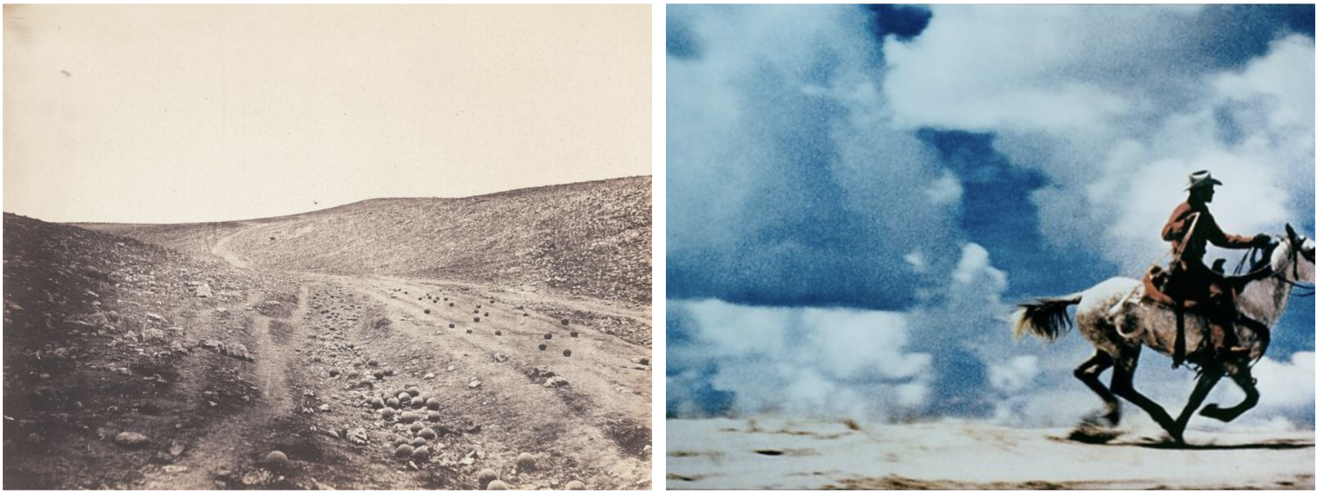
These landscapes both seems old. The on on the left is only of an actual landscape. The one on the right is a landscape but it also has a man riding a horse. Both landscapes are taken from a POV angle. Its basically an angle from which is taken at eye level. Both are taken from where the average human would see it standing up. In both images we are fairly close to the landscapes. This may have been done on purpose to make the viewer feel like they are actually in the photograph. The image on the right has been cut off, most probably from another, bigger image. After some more research, the image on the right has been cut off from an existing image that was an ad. This is interesting because its exploring the boundries of 'stealing' others people work.
BACK TO THE FUTURE
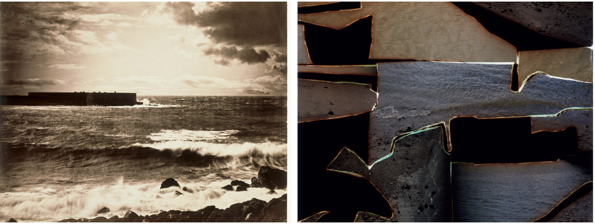
The picture on the left is a proper unedited landscape. It has not been constructed in any way. This way it has stayed in its original form since the day it was taken. The picture on the right seems to have been pictures of waves. But, it has been so edited that it barley looks like what the original might have looked like. Although they look very different, they still have some similar aspects. One main aspect are the waves in both photos. Both photos are pictures of the waves/ocean. However, the picture on the right has slight snippets of sand. This is unusual because in a normal photo taken of a beach, the sand is on the bottom, not the top. I would prefer to not live in either. The one on the right looks almost scary. The waves are intimidating while crashing against the rocks. It seems very uninviting. While the one on the left seems warmer, its all cut up. If i was living in the landscape itself, i would also have pieces of me missing or inverted. Looking back the picture on the right doesnt actually have sand, its just different types of water,
dafna talmor
|
" This ongoing body of work consists of staged landscapes made of collaged and montaged colour negatives shot across different locations, merged and transformed through the act of slicing and splicing [...] ‘Constructed Landscapes’ references early Pictorialist processes of combination printing as well as Modernist experiments with film [...] the work also engages with contemporary discourses on manipulation, the analogue/digital divide and the effects these have on photography’s status. "
|

|
MINIMALIST LANDSCAPES: WHAT REMAINS


Both these images are of trees in one way or another. The one on the left is a cutout of an actual tree surrounded by a black background. The one on the right looks more like a bush but its made in silhouettes aswell as what looks like some gardening tools. What surprises me is that they are both missing the core part of their image. The left is missing a background, and the left is missing detail. These pictures don't look hard to make. Cut out what you want in the photo and stick it on a piece of paper. I prefer the one on the left because its more pleasing to look at than the one on the right. This is achieved by it having more detail.

|
In 1996 Geraldo begin a new series of Photography, the Sobras (Remains). With the help of an assistant, he creates collages of negatives on glass plates re-using his old negatives from the 50's or family images. He used multiple exposures and camera rotations. In the last 2 years of his life he made Sobras(Remains), a final burst of photos which resulted in over 250 collages.
|
|
To make her pictures, Nielsen cuts, shapes, layers, draws on, and assembles transparent colour gels into a handmade “negative” which she projects varied light sources onto photographic paper.
|

|
keith arnatt
Keith Arnatt (1930–2008) was a British conceptual artist. As well as art his work is sometimes discussed to land art, minimalism, and photography. He lived and worked in London, Liverpool, Yorkshire and Monmouthshire.


photograms evaluation
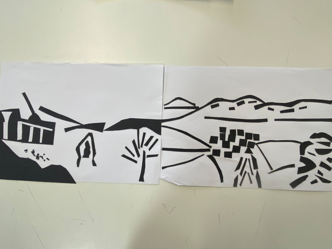
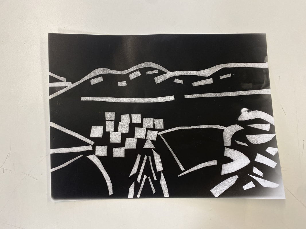
For this i used photographic paper and my silhouette landscape to create a photogram in the darkroom. We experimented using different apertures and how long we exposed the photographic paper to the light. I made 3 different photograms, one was under the light for 5 seconds one for 3 and one for 1. The one for 1 second came out the clearest whereas the one for 5 seconds was almost impossible to see. I was using the smallest aperture to get the brightest light. Next time would change the aperture to get different results. I am happy with how the photos turned out but would do them better next time as i will be more experienced. In the photograph a tree made with little squares and triangles is visible. Also, a bush is visible in the corner and in the center is what looks like a bunch of squares. The squares represents the houses down below in the village. At the top is a clear mountain range made with long clear cut rectangles. The lines are mostly jagged because it is mostly made up of real shapes. However, the mountains are curved to give them a more realistic view. In real life the picture is much more detailed than the one here. This gives the photograph a simplistic view but not too much where a person wouldn't be able to tell what's happening. This is obviously a landscape image of nature as well as the city below. I also created a big one and left it under the light for 7 seconds.
UTA barth - BLURRED PHOTOS


Uta Barth is an American photographer of German origin. In her career, her work focuses on the way of looking by reversing the relationship between the image and the ground, rather than focusing on environmental images. These photos were taken normally, just a little blurry. Actually these are just pictures and lights. However, when you look closely, the view is clear. Uta Barth has spent her career investigating the subtle changes that occur after light hits different surfaces, documenting the passage of time, and examining the difference between the human eye and the camera's perception of the world. She takes photos for ease of viewing. She explores the quality of light and its ability to influence and confuse people.
Photos inspired by uta barth


I took these photos using my phone a a technique used to make the camera blurry. The intention of these photographs was to imitate Uta Barth's blurred landscapes. These photos are landscape and a few are zoomed in. The pictures are all blurred with some having a field of depth with a close up detail such as a leaf or the pavement. They are still life with nothing going on. Many appear realistic enough to make out what is in the photo. To make them blurred, we used a trick to make the camera permanently blurred until you stop taking the photo. Put your finger in front of the camera and press hold on the screen. This locks the screen on blurred. Next time i would make them more blurred to make them seem more like Uta's.
UTA BARTH experiments

These images didn't take too long. I explored with the zoom of the camera to find the best aperture as to not
make them too blurry and not visible, but also to not make them unblurry. This is why some are more blurred than others. These photos were taken using the same technique as the ones we did in school. These are much better because when people look at these images they should be able to instantly tell they are inspired from Uta Barth. They are all landscape and colour, especially green, is very important to me and to the image. These photos are meant to be enjoyed without the viewer straining their eyes. I like this lazy look to photos and for some, they are comforting to look at.
make them too blurry and not visible, but also to not make them unblurry. This is why some are more blurred than others. These photos were taken using the same technique as the ones we did in school. These are much better because when people look at these images they should be able to instantly tell they are inspired from Uta Barth. They are all landscape and colour, especially green, is very important to me and to the image. These photos are meant to be enjoyed without the viewer straining their eyes. I like this lazy look to photos and for some, they are comforting to look at.
Diptychs


|
These images are called diptych. They are made using a simple process on FreeForm. I chose 2 photos that are significant to one another. One example is this one on the right. They have similar triangular shapes and similar style. These images are made for making a little book. Diptychs are very easy to make and take only around 3 mins each. If i were to do this task again, I would use more images.
|
|
|
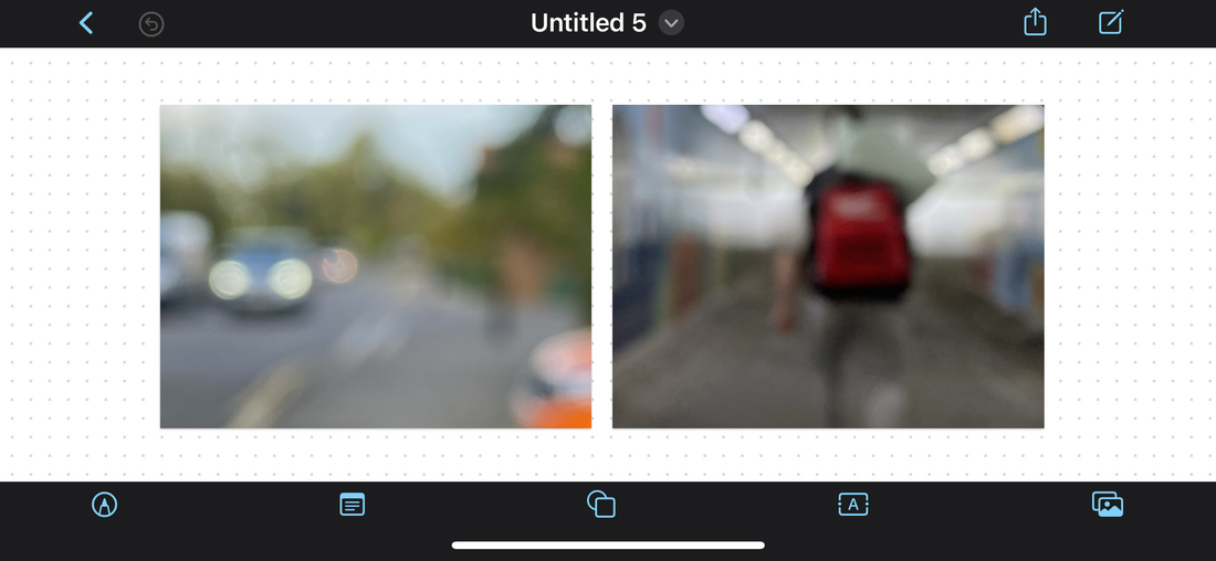
These 2 images correlate very well with eachother. The image on the left is very faintly of a car and a road, including some trees in the back. The one on the right resembles a man with a red backpack, walking. This represents the difference between the people who walk and the people who drive. The image relies on light and colour, with a hint of orange in the left image.
|

Here, i have put all the images in a sequence. This sequence is supposed to represent what a book would look like. I could do a fold out book, or maybe a black and white fold out film. Although colour is my main objective, black and white wouldn't be too bad to represent lifelessness. I may need a few more pages to be able to make a whole book, so I may take some more photos. In all the images of the sequence, I have outlines the similarities ; the way the camera is placed and the main shapes. The images are chosen because of this, but it was also chosen because of their representation. They've been specifically chosen to represent something, many representing nature clashing with humanity. Some represent smaller things such as the differences of people and a display of time. What i could do is remove the ones without nature and base the whole book on man vs nature. This would give me a subject to work with and would motivate me. They could also be edited ; making them smaller or bigger, or adding writing to explain the image.
slides inspired by dafna talmor and others
|
|
This video interests me because Dafna show us her process to making her work. She described her work as a utopia. This is an interesting word because to me her work looks more like the 4th dimension, a place where nothing means anything. This ties in to her saying her work is for the simple act of looking. Maybe her work isn't meant to mean anything, and she makes things just to make people curious and relaxed.
|
We created slides using a row of photographs turned them into negatives. These negatives were the exact size of the slides they were supposed to go into. With these slides we had free reign over what to do with them. Some added coloured plastic to colour the slides, and others scratched into the negatives themselves to customize what the final result would look like. I scratched into them, trying to draw. This didnt work and you need to be very precise. Im not very happy with how they turned out, so next time i would cut them up instead of scratch into them.


redo slide work
In this task i redid my slides, im very happy with how they turned out.


Homework


|
Drafts from Dionne Lee on Vimeo. |
To this video is quite boring. Not much is going on. Dionne Lee is ripping and cutting up piece of paper and layering them over eachother. I guess this way she is creating new landscapes while recording it. The project is the video itself, and can be sped up. I like it because its in the format of a video.
|


For these collages we cut up pieces of our landscapes and ripped up pieces of our landscapes to created abstract images. We used the same technique as Dionne Lee. With this we created landscapes that feel appealing to the eye but are also able to get the viewer to think about them. How they are composed and what they contain.
|
|
This video is inspired by Dionne Lee. I used the same tactic as her. I think mine is better because i moved at a faster pace so it wasn't as dull. I also made the video silent, so the sounds of moving around isnt there.
|
BINDI VORA


I would like to base my final project off the works of Bindi Vora. The work above is called Mountain of Salt. It was based in 2020-21. This piece of work was done as a response to Covid-19. Although that's what the artist suggests, I disagree. I believe this work is abstract, old and new. Every image has a meaning deeper than expected. Also, every image looks as if it has been taken in the 1960's. Many images show inequality, varying from race to the lower class. But the pure essence of this work for me is the randomness. Every image is different in its own way, with a different meaning and a different message. When I saw this work for the first time, I knew I wanted to create a response to it. It's so interesting how he has added subtitles and in a way adding a story to every image.

In this photograph there is a broken decrypt building. Possibly bombed from war (seeing as this photo was taken long ago.) Rubble is scattered on the floor and a singular wall of a building remains. Interestingly, an unscathed, quite fancy building stands firm in the background. This sharply contrasts the building in the front. In fact, some may say the building in the back was placed there, either digitally or by some sort of projection. Although, I believe this image was taken originally like this. As well as the image itself, there seems to be random shapes of colour around the image. In every photo from Bindi Vora, there is 3 or more random shapes with random colours. These shapes are curious as they supposedly have no meaning. In my opinion it's up to the viewer to decide what they mean. On the bottom of the image, there's a short message. On every image there is one, and on every image it has a meaning. For example this image scribes "and we must all do our part to 'shape change'" This is the reason this piece of work is so effective, it could lead to many different interpretations. Not one answer is correct, maybe they all are. It leaves room for discussion, that's what i like about Bindi Vora.
bindi vora inspired homework


These are my pictures inspired by Bindi Vora. These images still have to be edited and made to look how I want them. I should probably make them all square to to make the all similar. For these photos I moved around the area where I lived. I do like these photos, but if I were to take them again I would make them all landscapes. Most are eye level shots, but I decided to vary them because I wanted a wide range of different photographs. I wanted to replicate the sort of style that Bind Vora has, where one image isn't the same as another.
WWW : I do like the images I took as I am happy with how most of them turned out.
EBI : It would be even better if i had took every photograph the same ratio. Next time i would make them all square ratio or landscapes.
WWW : I do like the images I took as I am happy with how most of them turned out.
EBI : It would be even better if i had took every photograph the same ratio. Next time i would make them all square ratio or landscapes.


Starting the experimentation


This is one of my first drafts at making the images black and white. I am experimenting with using photoshop and making images look 'older'. Firstly, I made the image simply black and white. The image still had the newer generation camera quality. To try and make the camera quality look older, I made the image grainy and a certain type of blur. To do this I created a new layer named "Film Grain". It is an overlay layer with 'Fill with Overlay-neutral colour' on. Then, convert the layer to 'Smart Object' (so you can change the amount of blur later on. Next step is to press on Filter > Noise > Add Noise. When on the Add Noise pop-up, you can choose the amount of grain on your image, as well as choosing between Uniform or Gaussian. This is how I added a grain onto the image. I did this to make my images look a different type of black and white. My intention was to make the image look older.
The difference between the original and the photoshopped one.

|

|
This experiment was more of a beginning to photoshop and teaching myself the ways to get the images how i want them. I think it turned out alright, but in my next experiments ill surely do more and experiment more.
Experiment 2
In this experiment im going to try other types of editing processes, as well as not adding grain to the image. Im also going to experiment with the size ratio of the image


The Difference Between The Two Images

|

|


The image on the left is black and white but also has film grain on it. It also has different dimensions. The image on the right is a little more portrait, it also doesn't have film grain. My idea is to employ both these tactics in the images I make on photoshop next time. Inspired by Bindi Vora whose images are different resolutions and different quality.

NEW PHOTOS FOR EXPERIMENTATION


experiment 3


In my third experiment, I have added short titles and also made one colour bold in some images. Ive made them all a certain width. I do like these photographs, but i want t think grander. I know i work better with my hands. So for my next experiment im planning on making cyanotypes then creating a book.
experiment 4


In this experiment I've made the images black and white then inverted them. I did this in photoshop to create cyanotypes, however i didn't create them due to the fact that they're not landscapes.
