An introduction
-One portrait i remember very well was when i was in Romania and i took a picture of my older sister surrounded by snow.
-It stood out because the background was slightly blurred making her stand out in the photo.
-Her clothes also stood out with the white background and she was looking away from the camera
-It stood out because the background was slightly blurred making her stand out in the photo.
-Her clothes also stood out with the white background and she was looking away from the camera

|

|
photo re-creation


In this task we were asked to recreate the photos we chose. We used 2 jumpers and positioned ourselves on a hill. In one photo we were looking away from the camera and in some we were looking directly at it. This task was easy and i had fun doing it. We were looking at the sun and sometimes away to get the best lighting and we didnt take photos past the waist.
homework


I found the task a little challenging because i didn't have a matching shirt as the one in the photo and i didn't have a blue snow globe. Also my haircut is not the same. it looks a little bit like the original because Im looking in the same place and am holding the object in the same position. Also the background is not similar. To make it better i could have used a similar background and clothes.
NICO FRO PHOTOGRAPHY


NICO FROELICH - ENVIORNMENTAL PHOTOS
Nico Froe takes every day photos of people going about their day in SE London. He frames his photo usually centred and they is usually natural lighting. He usually does not know the people he takes pictures of and he takes them because he thinks they look interesting. The background is important because the colour vibrate off of the people aswell as making the pictures stand out more.
Enviornmental school photos


We were asked to take environmental photos of people going about their day and ask people if we can take pictures of them. The task was easy and it was fun because we were able to move around the school and do our own things. Although it was fun, since we were in school we were held back because we were in a restricter area so we had to be creative. Outside of school i would use a much larger area and photography different people in other locations. I would also visit actual public locations and try to get creative with lighting and angles. I would also try not restrict myself to only one style of image.
COMPARE AND CONTRAST


The similarities of these photographs are the resolution. They're both portraits taken with very old camera. The differences are that one is black and white another is almost like green. One of them is taken from the chest up another from the waist up. The image on the right seems to be a man sleeping with a hat in the background. The image on the left is a man not looking at the camera wearing a coat. I think the image on the right in only head and shoulders because he couldn't see what he was photographing. I think the person in the left was posing for the camera as being asleep. I would say that both of these people are wealthy since cameras back then the cost of getting your photograph taken was 6$ ($216.71) in present day.) I prefer the photo on the left because there is more to look at and it tells more of a story than the one on the right. I would ask the photographer how they took the photograph and why they posed as they did.
TYLER MITCHELL


-Tyler Mitchell takes photographs because he has a desire to express a truth about cultural identity.
-Tyler Mitchell it the first photographer to show light onto other cultural identities in the way that he does
-Tyler Mitchell tries to not have a hierarchy in his photographs
-For him, it is important that he works closely with the person hes taking photographs from.
-He is influenced by a trip to Cuba, a very colourful country
-Colour is a very important aspect in his photographs
-His photos seem very youthful and stand out from the crowd
-He uses colour in very creative ways to catch people eyes


In these photos we moved around outside the school. We used props such as perfume bottles, a cardboard funnel, a glass lens and a square with a hole. In one photo we used a pink light and a light bulb to make the white hoodie stand out. Also Tom, the person in the photo, is looking towards witch is pointed towards the light. We also used the entrance to the darkroom to make a black background and used the cameras built in flash to light it up. When we were outside we used a circular lens and we put it up to our eyes to magnify it. The picture with the light bulb is most successful as the colour contrast really blends off the hoodie and the light bulb.
CENTRAL LONDON GALLERY VISIT


ELEMENTS OF A PORTRAIT


In this task we were asked to take different types of portraits. In the first one we had to take a portrait eligible for a ID or a passport. We used a white background and only got the face in the camera shot. In the second one we were asked to take a photo of a prison mugshot. We used a book that we found as a prop and put on an angry/anxious facial expression to show that prisoners are angry and are stressed. In the third one we had to take a self portrait. I used the camera facing towards me and made a friendly look. In the last one we had to do a family snapshot. We went infront of a white background and sat in chares and smiled. I found these tasks easy because it didnt take long and they were straightforward.
The relationship between portraits in art and photography


In this task we were asked to take portraits of art. In the first and second we took a red, white and green robe aswell as a white rag as the hair. In the third and fourth we wore a red dress with a red blanket and used a basketball to represent a skull. We also used white rope as hair and white rags. I found this task quite challenging because we had to be imaginative with our limited resources. We used the entrance to the darkroom to get a black background and we used the camera flash. WWW-great costumes and poses. EBI-we used the black background
REFINING IMAGES


In this task we were told to recreate the images from last week and refine then (make them look better.) We used the 2 images we recreated last week and used better props and backdrops. We used the black backdrop to get a better example of the photos we are recreating. Also, compared to last week, we used a blue headband instead of green to better match the image. We chose to do this because it better matches the art images we were copying. We found this task easy because we were just refining photos we already took.
WWW - I am happy i was able to take photos clearly and dress up as the character we were imaging.
EBI - Next time i would like to spend a bit more time looking closely at the images and looking at the exact way the person is looking and how they are dresses, including props. Next time i intent to frame the picture better and analyse the original picture better.
Cyanotype
Cyanotype is a low-cost, slow-reacting formulation for photographic printing that is sensitive to a narrow portion of the near-ultraviolet and blue-light spectrum, or UVA radiation, between 300 nm and 400 nm. Sir John Hershchel discovered the cyanotype and gave it its name. He published his study of light on iron compounds in 1842, hoping that photochemical reactions would reveal the ultraviolet or "actinic" rays that Johanne Rhitter had discovered in 1801 and the extremes of the electromagnetic spectrum that his father had seen. The cyanotype is made by simply washing the paper in water. Shadows and middle tones of blue appear in areas that are illuminated; Highlights are produced as the excess, unexposed iron salts are washed away.
ANNA ATKINS
Anna Atkins, an English botanical artist, collector, and photographer, was the first to use photographs to illustrate a book. Her cyanotypes from the nineteenth century created impressively detailed blueprints of botanical specimens by combining simple chemical processes with light exposure.
PHOTOGRAMS-MAN RAY RESEARCH
A photogram is created by placing objects on photographic paper and exposing it to light. He was primarily regarded as a painter, despite the fact that he produced significant works in a variety of media. He was a well-known fashion and portrait photographer, but his groundbreaking work earned him the most recognition. He also gained a reputation for his work with photograms, which he referred to as "rayographs" to refer to himself. The photogram, a type of photograph taken without a camera or lens, was referred to as a "rayograph" by Man Ray. Photograms are made by placing objects on light-sensitive paper and exposing them to light. The light areas of the print can be seen where objects have restrained light from exposing the paper. By exposing the photosensitized sheet of paper to light, Ray Man applied objects like thumbtacks, wire coils, and other circular forms directly to it.
portraits


In this task we were asked to take portraits using the back screen and the lights. We sat on a chair and we used the purple and green colour filter. My favourite one is the one where he is looking directly at the camera with purple lighting. This task was fun and we found it difficult to set up the lights and the back screen.
lee friedlander


I like these photographs because he does some very interesting things with lighting and has abstract images. He covers his face in 3 of them. He uses lighting and other props like a flower bush and a trophy. The photo i chose is the first one because its creative and uses mirrors in an interesting way.
SELF PORTRAITS


In this task we had to take self portraits using the colour filter and the back screen. We used props such as a blanket and a styrofoam body. We used the green and purple filters and got others to take the self portraits. My favourite is the one where i am laughing because it's a natural moment and my face is blurred. This task was fun and easy.
rankin-destroy project


Rankin says that fashion and celebrity photography might be criticized because they are seen from a different perspective. Rankin believes that he is the primary target of such criticism. One way he can respond to those who disagree with him is through his new project, "Destroy," in which he allows his images to be destroyed and sells them to raise money for a charity that helps young musicians. His objective is to demonstrate the abilities required to produce eye-catching images that everyone will notice. Rankin faces challenges as a result of this project, one of which is learning the challenging techniques used to create these portraits or memorable portraits of people. Advertising photography is so successful because of this.
"Photographers create memorable and striking images by using strong lines in the images," as Rankin puts it, "pictures are a lie."
Different from commercial photographers, fine art photographers have complete control over their images and can choose to make them as clear or abstract as they like. However, in commercial photography, they are unable to. Commercial photography lacks artistic freedom and is more controlled.
PORTRAITS


In this task we had to take portraits and self portraits to use for the photopea task and the colour copy task. We went outside and used the brick wall to give it a nice background. The background contrasted with the green coat and green hoodie. Also we used the bench with the sun going over out head blocking our face. This task was fun but we had to think hard about our positions and what we were going to do.
photopea, photogram, colour copy and cyanotype


In the first task we were asked to use Photopea to edit images we took. We took inspiration from the Rankin destroy project. We used the liquify tool and some filters to give a grainy background. The pictures were effective because of the brick wall behind us and we are both looking away from the camera.

|
With the photogram we set objects down on the picture in the darkroom do 'destroy' the image by blocking the light with things like scissors and string. It's effective because the objects i used are random and its slightly covering my face. I found this task fun and engaging because we got to move around and to talk to others.From this task i have learned that you do not need a camera to make a good portrait .
|
|
We created a colour photocopy using 2 contrasting colours. The first thing we did was use a self portrait of ourselves and cut it into 4-5 pieces. Then, we put the cut up pieces into the printer at random and I copied it in a navy blue colour. I put the printed image back in the printer and printed it with a magenta colour making 2 contrasting colours. I think this photos strong points are the brick wall and and way it is cut up. The brick wall seems almost like its wrapping around itself, seemingly distorting reality. My body itself is scattered around working well with the brick wall. I think people would find this image confusing and so do I. Also, there is a faint double image of me in a dark pink colour. This gives the sense of emotions or another you. I think the layout and colour contrast in the most memorable thing about this photo. From this task i have learned that the looks a photo can be changed without an editing software.
|

|
SELF PORTRAIT - LEE FRIEDLANDER
|
Facts to Know
- Friedlander used a Leica 35-mm camera to take black-and-white photographs. - From the beginning, he made the viewing experience more difficult by using side-view mirrors, plate-glass doors, and storefront windows' reflections. -Friedlander's portfolio includes a lot of portraits and self-portraits. -His early work was influenced by Walker Evans, Eugène Atget, and the spontaneous street aesthetic, or "snapshot" aesthetic. |
portraits


In this task we were asked to take 30 portraits in the style of the photographer we chose. I chose Lee Friedlander and took 30 portraits in his sort of style. I used many props from around my room in different ways, using lights, books and other things like a camera and a laptop. This task took me quite long because whilst i was approaching the end i was running out of ideas. If I were to do this task again i would turn the photos into black and white like how Lee Friedlander did.
ziqainqian


|
Photography has many genres, some of which are borrowed from painting (e.g. still life, portraiture, landscape). Some are special to photography (e.g. photojournalism). Artists/photographers often play with our expectations about genre for creative purposes. A genre can be described as a category, or type of photograph. It is a French word for branch, kind of species. Most of the genres used by photographers have already existed as genres which were formulated in painting, before photography was invented.
|

I chose this photo because it really gets me to think about the composition. When i look at this photo i feel almost calm. This image is a self portrait using a mirror and a branch obscuring the vision of the reader. The background and the table has a light, dull brown colour contrasting with the branch and the edges of the mirror. The use of the branch is effective because of the background and the thing that almost looks like a small tree stump. The branch almost sends the message of death and the stump being rebirth. The branch, being dead, is centred in the photo being the first thing a viewer sees. The woman in the foreground in reflected in the mirror shirtless. Almost naked, she could give off the vibe of life or rebirth. The two things contrast, making viewers feel melancholy..The stump being from a tree represents rebirth but maybe also death and it seems to have been cut down. The beige colour is the same as dirt, the birthplace of all plants and land animals. The mirror is reflecting both the branch and the woman showing the balance and contrast between these two things.
- This photograph shows a woman, a mirror, a branch, a table and almost a stump.
-This photo was taken by Ziqianqian
-My knowledge on this photograph is limited, i just went off the facts that i could maybe pick out from the colours and props. My analysis of this photograph is just my first thoughts when viewing.


ZIQAINQIAN MIRROR PORTRAIts recreation


In this task we were asked to take 30 portraits in the style of Ziqainqian. In her work, her face is always cut out or blurred out. In this task i had the most fun i ever had from a homework/out of school task. In all the other photos, i used a wall mirror that i took down and placed on a night stand. I moved the night stand to face a white wall. I took the pictures over the course of 2 days, which is why i had used the flash in half of them (i think it looks better.) Although i think these images are good, they could use a lot more improvement. For starters, i should have used more props. Also, i should have used another, smaller mirror and do reflections off the big mirror. I should have used another room or a different place, since they all look similar. Now that i look at them again they look quite dull. It would be EBI i used props effectively and more efficiently.
PORTRAITS


In this task we were asked to take portraits using a mirror in the classroom and block 1. I took them with my phone and a small square mirror. The task didn’t make much sense since all we had to do was take portraits. This task was decently fun and i found it ok.
PLAN
My plan is to use the different lights in the studio to do a light workshop using different colours. I am going to take ideas from the Light Workshop task we did a few months back.
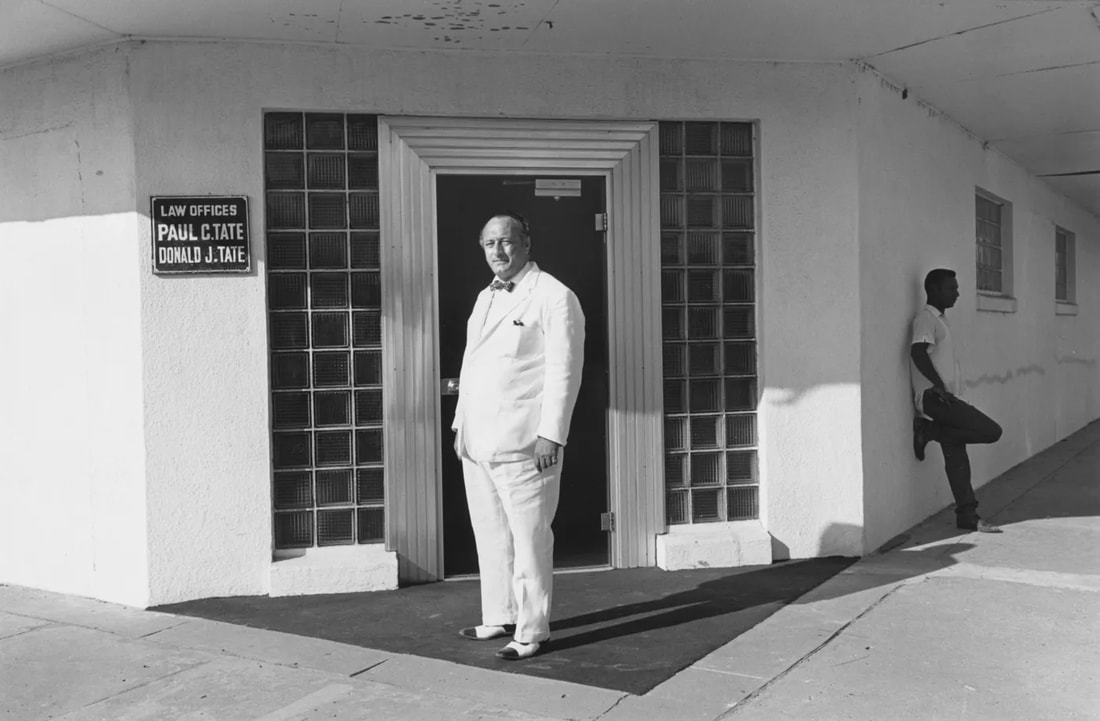
LEE FRIEDLANDER
|
This photograph was taken by Lee Friedlander. The camera is positioned outside the car showing the front window. Inside the car is a man, looking distressed and driving away from what looks like a town in the back window. The landscape is interesting as it looks like a rural town with a lot of greenery. The picture is in black and white adding to the sad expression of the man. This photograph makes the viewer go under the impression that the character driving has just undergone something upsetting. The way he is leaving behind a town could suggest that
|

|


FINAL PLAN


My plan is to lay out my photos on a black card or a black sheet of paper and mount it. I need to make the images bigger so they fill the space better. I drew my plan out on a piece of paper to help me visualize the final outcome. Also, i stuck the photos using blutack to the sheet. The photos were taken using a camera and the contrast was put lower to make them darker. We used the lights and the different colour filters to make the multi colour effects
